Note
Go to the end to download the full example code.
Using an Asymmetric Heating Profile Under the Single-fluid Approximation#
In this example, we force the electron and ion populations to have the same temperature to illustrate the single fluid case.
import astropy.units as u
import matplotlib.pyplot as plt
import numpy as np

from astropy.visualization import quantity_support

import ebtelplusplus

from ebtelplusplus.models import DemModel, HeatingEvent, HeatingModel, PhysicsModel

quantity_support()
<astropy.visualization.units.quantity_support.<locals>.MplQuantityConverter object at 0x71408bbee480>
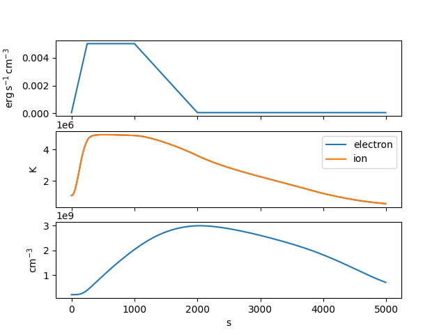
Set up a trapezoidal heating profile that rises for 250 s, stays constant for 750 s at a heating rate of 0.05 erg per cubic centimeter per second, and then decays linearly to the background rate over the course of 1000 s.
In this heating model, we equally partition the injected energy between the electrons and the ions.
heating = HeatingModel(background=3.5e-5*u.Unit('erg cm-3 s-1'),
                       partition=0.5,
                       events=[event])
Note that we also need to enforce the single-fluid requirement in our physics model.
physics = PhysicsModel(force_single_fluid=True)
Now run the simulation for a 40 Mm loop lasting a total of 3 h. We’ll also specify that we want to compute the DEM
Let’s visualize the heating profile, temperature, and density as a function of time.
fig, axes = plt.subplots(3, 1, sharex=True)
axes[0].plot(result.time, result.heat)
axes[1].plot(result.time, result.electron_temperature, label='electron')
axes[1].plot(result.time, result.ion_temperature, label='ion')
axes[2].plot(result.time, result.density)
axes[1].legend()
<matplotlib.legend.Legend object at 0x71408a443530>
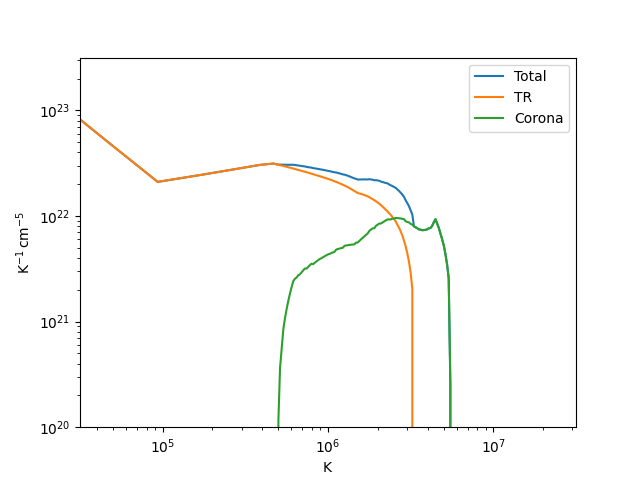
Finally, let’s visualize the DEM distribution. We’ll first time-average each component over the duration of the simulation.
delta_t = np.gradient(result.time)
dem_avg_total = np.average(result.dem_tr+result.dem_corona,
                           axis=0,
                           weights=delta_t)
dem_avg_tr = np.average(result.dem_tr,
                        axis=0,
                        weights=delta_t)
dem_avg_corona = np.average(result.dem_corona,
                            axis=0,
                            weights=delta_t)
And now we can plot each component
fig = plt.figure()
ax = fig.add_subplot()
ax.plot(result.dem_temperature, dem_avg_total, label='Total')
ax.plot(result.dem_temperature, dem_avg_tr, label='TR')
ax.plot(result.dem_temperature, dem_avg_corona, label='Corona')
ax.set_xlim([10**(4.5), 10**(7.5)]*u.K)
ax.set_ylim([10**(20.0), 10**(23.5)]*u.Unit('cm-5 K-1'))
ax.set_xscale('log')
ax.set_yscale('log')
ax.legend()

plt.show()
Total running time of the script: (0 minutes 0.212 seconds)